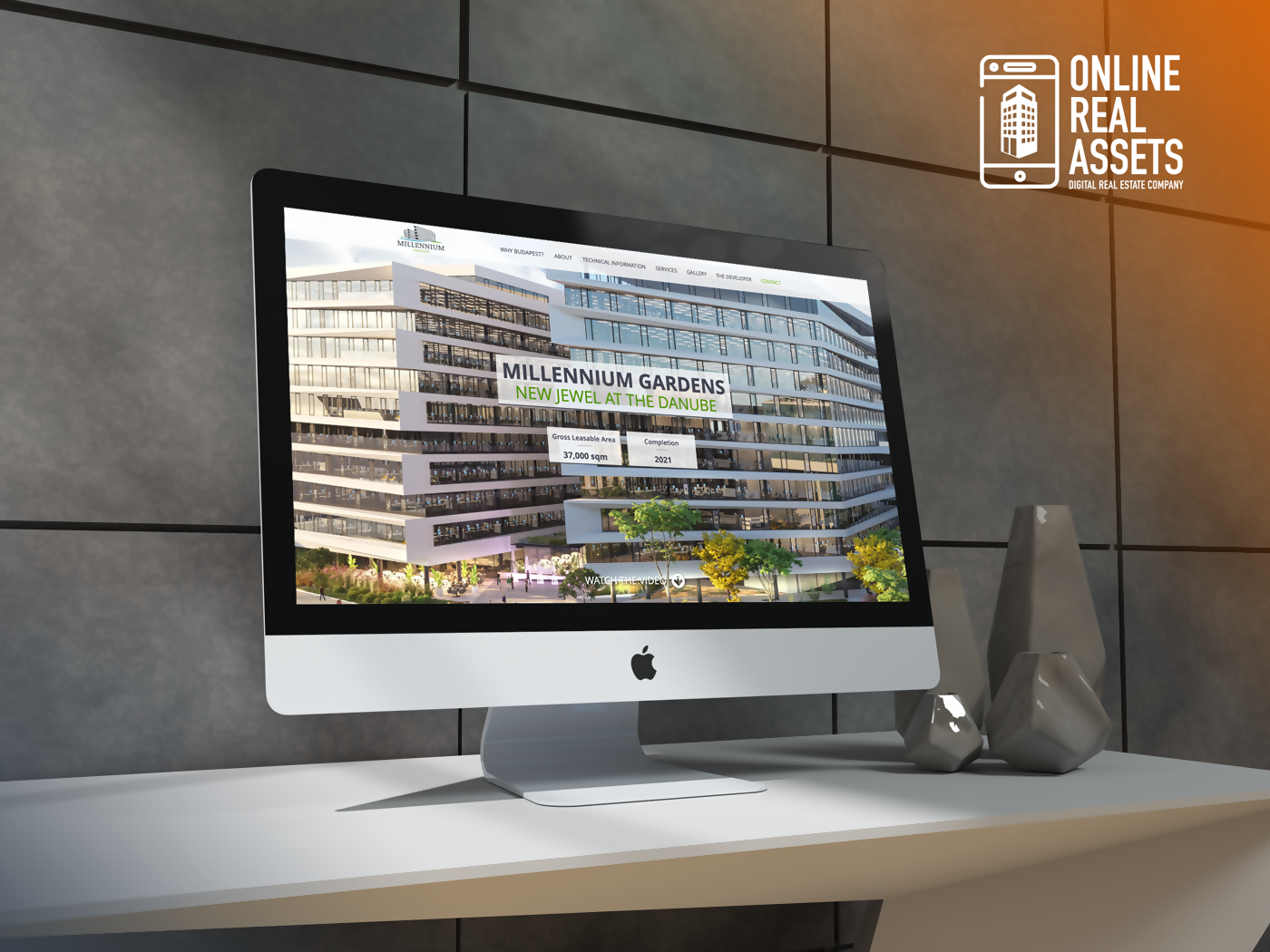
1. How to engage visitors? Engaging Visuals / Videos
If you want to impress your visitors, you should show off your building right at the top of your property website with a large image/video. You can also add a catchy slogan or some details, like GLA or the location of the building.
A video / 3D visualization is an even better way to impress visitors and provide an immersive experience but be aware to have several visuals in your repository. For instance, while you might have an amazing video of your building, you might not be able to use it as background, only on desktop devices, since mobile browsers block these types of videos to save data for the user.

2. How to catch the attention of visitors? Use interactive Infographic.
The goal here is to avoid using plain text as much as possible. Key details can be easily highlighted via an interactive infographic using various icons. It will structure the information, making it much better and easier to understand.
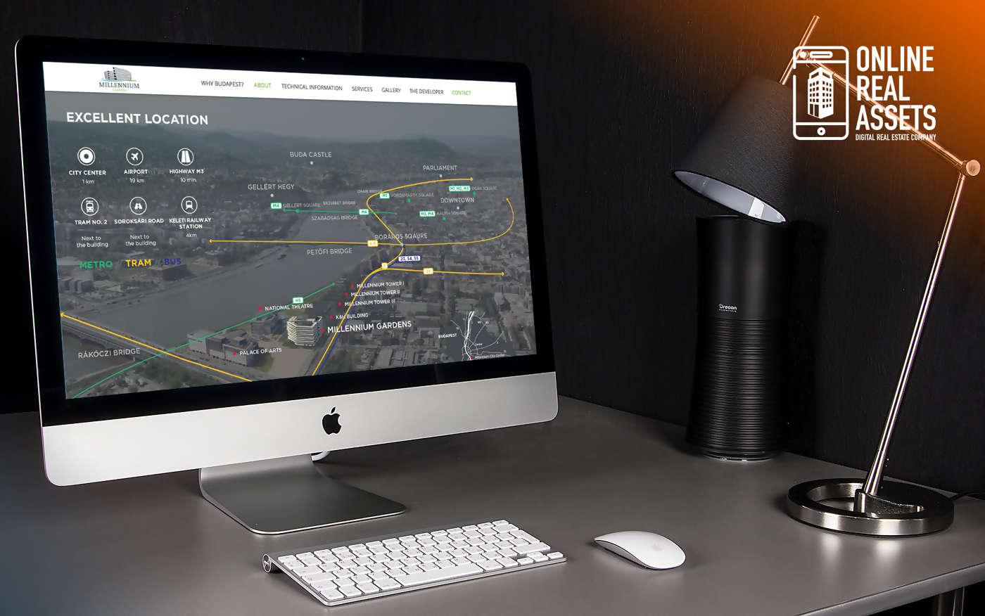
3. What about the location, location, location? Highlight the neighborhood.
Your location is much more than an address. Why not show your visitors all the surroundings, public transport, restaurants, bars and fitness centers nearby, so they can fully project themselves into your property? Usually, we create a large graphic to highlight the surroundings of the buildings of our clients.
A simple Google Maps integration is getting pretty standard across property websites, and, in most cases, it doesn’t look very good; that’s why we decided to add this extra to our designs.

4. What about technical details and floor plans?
Especially in the case of commercial properties, besides being visually attractive, the integration has to provide the visitor with all key information of interest. In our experience, an interactive floor plan browser with high-quality images and animations (or even better a 3D visualization) with the all the necessary technical details on the side is usually the best way to achieve this purpose.
5. What is the ROI of a website? NO ROI without CTA.
The call-to-action, or CTA, is the most important section of a website. This is the point where you have the option to convert the visitor to an actual lead. There are many forms of CTAs, from a simple contact form to an interactive calendar to book a visit (used especially by co-working / shared offices).
The most important thing here is to be clear and step out a bit from the standard flow of the website. The subject of optimizing a site for maximum conversions is a very complex topic; but for property websites, the most important thing is to provide the visitor with a clear CTA. Thus, don’t be afraid to use unusual solutions to make your brand memorable.
Interested in a new property website? Visit www.onlinerealassets.com or drop us an email at [email protected].


